
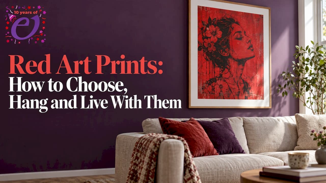
The best red art prints are the ones where red does a job: it anchors a room, sets a mood or gives one wall a single confident point of focus. Pick the print first for its subject and finish, then match size, position and paper to the space. This guide covers what red means in art, how to choose and hang a print, what to check on materials, and where our own red-led work fits.
TL;DR
- Red is a colour with a long, mixed history: love, danger, power, wealth and celebration all sit under it, so the subject of the print matters as much as the shade.
- Hang the centre of a print 145 to 150cm from the floor, and 15 to 25cm above a sofa back or headboard.
- Aim for art that spans roughly half to 60% of the wall width, or the width of the furniture beneath it.
- Check the paper, the inks and how the piece is made, not just the picture.
- Our Charming But Deadly fine art prints run from £29 to £170, and the Ink on Red collection is built around the same bold palette.
Table of Contents
- What "red print" means when you shop
- What red means in art, and why it changes the room
- Styles and formats of red art prints
- Choosing a red print for the room you have
- Frames, mounts and where to hang red
- Materials: what to check for a more sustainable red print
- Looking after a red print
- Red art prints from Enamor
- Buying red art as a gift
- A short checklist before you buy
- FAQ
- Sources
What "red print" means when you shop
People type "red print art", "red wall art prints" and "red art prints" for the same thing: a framed or unframed picture in which red is the dominant or defining colour. It can be a bold abstract, a portrait, a graphic illustration or a photograph with one red note. There is no single technical meaning that sets a "red print" apart; it is a shopping shorthand for colour-led work.
That looseness is useful. It means you are free to choose by feeling rather than category. A pillar-box red graphic and a deep burgundy figure study are both red art, and they will behave very differently on a wall.
What red means in art, and why it changes the room
Red carries more cultural weight than almost any other colour, and the weight is not the same everywhere.
In China, red is considered auspicious, tied to life-generating energy, celebration and prosperity. The same Smithsonian page notes that in ancient Egypt it was associated with royalty and with passage through the afterlife.
In Western art history, red has stood for romantic love, seduction, danger, power, dominance, wealth, prestige, and sacrifice and redemption. That list explains why a red picture rarely feels neutral. It is warm and welcoming in one image and faintly threatening in the next.
Part of red's status comes from cost. The National Gallery's discussion of the colour points out that red clothing signalled high rank because the finest red dyes were hard to make, with rare sources such as kermes, cochineal and madder making them expensive. A red wall still carries a little of that sense of occasion.

How to use the meaning when you choose
You do not need to be an art historian. Ask what you want the room to say:
- Warmth and welcome: deeper, earthier reds suit dining rooms, hallways and living rooms where people gather.
- Energy: a bright, saturated red works in a home office, studio or kitchen where you want a lift.
- Drama: red set against black, white or cream reads as graphic and confident, and suits a single statement piece.
- Tension: if the image has an edge, a portrait with a slightly unsettling expression for example, red amplifies it. That is the point of such work, so give it a wall where you want conversation.
Styles and formats of red art prints
Red prints come in several broad styles. Knowing them narrows the field quickly.
| Style | What it looks like | Works well for |
|---|---|---|
| Abstract and brushstroke | Gestural red marks, colour fields, soft gradients | Modern living rooms, calm bedrooms |
| Portrait and figurative | Hand-drawn faces and figures with red as accent or ground | Statement walls, studies, hallways |
| Graphic and illustrated | Flat colour, strong line, poster-like composition | Kitchens, offices, shared flats |
| Photographic | Red as a single note in a scene | Neutral rooms that need one warm point |
| Vintage and museum-style | Reproductions of classic work in red tones | Traditional interiors, libraries |
Format matters as much as style. A small print on a shelf or in a cluster of frames behaves like an accent. A single large print behaves like a piece of furniture. Decide which role you want before you look at sizes.
Limited editions and signed prints
Some prints are made as a limited run or signed by the artist, and some are made on demand. Our own fine art prints are drawn by hand by one named artist, Armin Sheibani, and we produce them only when they are ordered. If you want a piece that has a clear author rather than an anonymous design, this is the question to ask of any seller: who made the original, and how is the print produced?
Choosing a red print for the room you have
Start with the existing colours
Red works with more of your palette than you might expect.
- Neutral walls (white, cream, grey, greige): red is the easy hero. One print is enough.
- Dark walls (navy, charcoal, forest green): choose a red with depth, such as burgundy or rust, so the print glows rather than clashes.
- Warm woods and leather: red echoes them. Look for earthier, browner reds.
- Busy rooms with lots of pattern: pick a print with plenty of white space around the red, or keep to a single colour so the print has room.
- Rooms with one existing red object: a cushion, a rug or a lamp. Pull the print's red towards that shade, or deliberately contrast it, rather than landing in between.
A useful rule: if you cannot decide on the shade, hold a cushion, a mug or a piece of fabric in the red you like against the wall in daylight and again in the evening. Red shifts more than most colours between daylight and lamplight.
Choose the size by the wall, not the print
A print that is too small is the most common mistake. One UK guide to hanging art suggests that art should span at least 50 to 60% of the wall width, or the width of the largest piece of furniture below it. Over a 2m sofa, that points to a piece, or a grouped set, of around 1m to 1.2m wide in total.

If the single print you love is smaller than that, build a group. Three or four prints in matching frames, spaced evenly, read as one larger piece. Keep the gaps consistent, and let the red print sit at the centre or at the eye line of the group.
Hang it at the right height
The same guide recommends hanging the centre of the artwork 145 to 150cm from the floor, which is roughly eye level. Above a sofa or bed, it suggests positioning the piece 15 to 25cm above the sofa back or headboard so the two read as one arrangement.
A quick method:
- Measure the height of your print including the frame and halve it.
- Add that half to 145 to 150cm to find where the top edge sits.
- Measure from the top edge to the hanging wire or hook on the back, and subtract.
- Mark the nail position in pencil, then check with a spirit level before you hammer.
Cut a piece of paper to the print's size and tape it to the wall first. Red is a powerful colour, and seeing the footprint of the piece for a day tells you whether you want it a little higher or lower.
Frames, mounts and where to hang red
Red prints respond strongly to their frames.
- Black frames make red look graphic and sharp.
- Natural oak or ash softens it and suits warm, homely rooms.
- White frames and generous mounts let the red breathe and suit lighter rooms.
- Gold or brass leans traditional and pairs best with deep reds.
A wide mount, the card border between picture and frame, adds calm around an intense colour. If a print feels loud on its own, a mount is often the fix rather than a different print.
Place it where you will see it for a few moments at a time, not where it will be the first thing you see every time you walk past. A hallway, a landing, the wall facing a sofa or a dining room all suit red well. In a bedroom, many people prefer a deeper, quieter red above the bed and keep brighter work for other rooms.
Materials: what to check for a more sustainable red print
Paper and production decide how long a print looks good and how kind it is to the planet.
Paper. For work you want to keep, conservation guidance from Museums Galleries Scotland says good paper and card contain 100% cotton fibres or a high percentage of alpha cellulose, and that poor-quality materials can transfer damaging substances onto paper. In practice that means choosing prints on cotton-rich or acid-free paper and mounting them with acid-free board.
Inks. Some independent printmakers work with vegetable-based inks and clean their equipment with natural ingredients. If sustainability matters to you, look for a seller who tells you what inks are used rather than only the finish.
Packaging and production. Ask whether the piece is made to order or printed in bulk and stored, and what energy powers the facility. Made-to-order work cuts down on unsold stock.
Eco-minded art generally. Home-design writers describe an eco art movement that includes bespoke handcrafted pieces and work made with recycled materials such as paper, glass and plastics. A red print can be part of that, but only if the production details back it up.
Our approach: every design is produced only when ordered, to avoid waste. Our work is printed on certified organic cotton and made in a renewable energy-powered facility, and we offer a remanufacturing option for worn items.
Looking after a red print
Red inks and dyes are often the first colour people notice fading in a bright room, so treat placement as part of the purchase.
- Keep prints out of long, direct sun, especially on south-facing walls.
- Avoid hanging directly above radiators or in steamy bathrooms and kitchens next to the hob.
- Use a mount so the print does not touch the glass.
- Dust the frame, not the print, and keep paper dry.
If you want more detail on handling and storing paper, the Museums Galleries Scotland guidance linked above is a clear starting point.
Our view: red should be personal
We draw every piece by hand, and red is not a decoration we add at the end. In our Ink on Red collection and across Charming But Deadly, it is part of the mood: beautiful on first look, with an edge once you spend time with it.
That is why we think a red print should be chosen like a portrait of someone you want to live with, not like a paint swatch. Choose the image that holds your attention, then work out the room around it.
We also think the way a print is made is part of its character. Each design is an original by a single named artist, produced only when ordered, on certified organic cotton in a facility powered by renewable energy. Wear it, hang it, give it: the idea is the same.
enamor
Red art prints from Enamor
If you like red with a sharper edge, our Charming But Deadly fine art prints are drawn by hand by Armin Sheibani and cost between £29 and £170 depending on the piece. You can browse the Charming But Deadly fine art prints or look at the Ink on Red fine art prints for the collection built around the colour.

Some single pieces to start with:
- Charming But Deadly Fine Art Print, the title piece of the collection.
- The Encore Fine Art Print and The Ritual Fine Art Print.
- The Blessing Fine Art Print and The Crew Fine Art Print.
Prefer to wear the artwork? Our Charming But Deadly clothing is priced from £32 to £37, and the Ink on Red clothing carries the same artwork on organic cotton. It also makes a good gift for someone who already has a framed print on their wall.
Buying red art as a gift
Red is a confident gift colour, but it helps to match it to the person.
- For someone who loves bold interiors: a larger print they can hang as a focal point.
- For a first home or a new flat: one statement print, framed, that they can move with them.
- For someone who cares about sustainability: a made-to-order piece on organic cotton, with clear production details.
- For a person who prefers not to commit wall space: printed clothing carrying the same artwork is an easy alternative.
If you are unsure of size, choose a mid-sized print that works above a sofa, desk or console table. Bear in mind that red's cultural meaning varies: in some traditions it signals celebration and good fortune, so it can be a thoughtful choice for a wedding, new home or new year gift.
A short checklist before you buy
- Subject: would you still want to look at it in a year?
- Shade: have you seen the red in both daylight and lamplight, ideally against your own wall colour?
- Size: does it cover about half to 60% of the wall width or the furniture below it, alone or as part of a group?
- Paper and inks: is it printed on cotton-rich or acid-free paper, and does the seller say what is used?
- Production: is it made to order, and by whom?
- Frame and mount: have you chosen a frame colour that suits the red rather than fights it?
- Placement: is it away from long, direct sun?
FAQ
What does red symbolise in art?
Red has no single meaning. In Western art it has stood for love, seduction, danger, power, wealth and sacrifice, while in Chinese tradition it is linked to celebration, prosperity and life-generating energy. The image around the colour decides which meaning comes forward.
What does "red print" mean?
In shopping terms it simply means a print in which red is the main or defining colour, whether abstract, figurative or graphic. Readers also search for it as red print art or red wall art prints. It is a way of choosing by colour rather than a separate technique.
How high should I hang a red art print?
Hang it so the centre sits 145 to 150cm from the floor. Above a sofa or bed, place it 15 to 25cm above the back or headboard. Test with a paper template taped to the wall before you drill.
What colours go with red wall art?
Neutrals such as white, cream and grey let red lead. Deep navy, charcoal and forest green suit burgundy and rust reds. Warm woods and leather echo earthier reds, so look at the browns and oranges in the room as well as the walls.
Sources
- Red, Smithsonian National Museum of Asian Art
- Colour Stories: Red, National Gallery, London
- The Complete Guide to Choosing and Hanging Wall Art in Your Home, Inspired Homes
- Caring for paper collections, Museums Galleries Scotland
- How to choose wall art for your home, Redrow